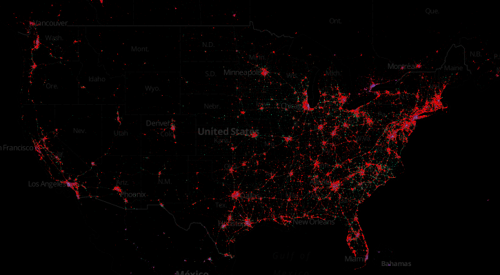
A cool startup called MapBox which helps businesses and people create custom maps with open source tool, just scanned more than 280 million Tweets that were tagged with location data to create a compelling searchable map of the world showing off where people are using their smartphones, and which brand of smartphone they’re using. In the worldwide map above, you can see iPhone (red), Android (green) and Blackberry (purple) usage. But the cool thing is the ability to zoom in on any geographic region, which reveals some interesting stories.
New York, NY
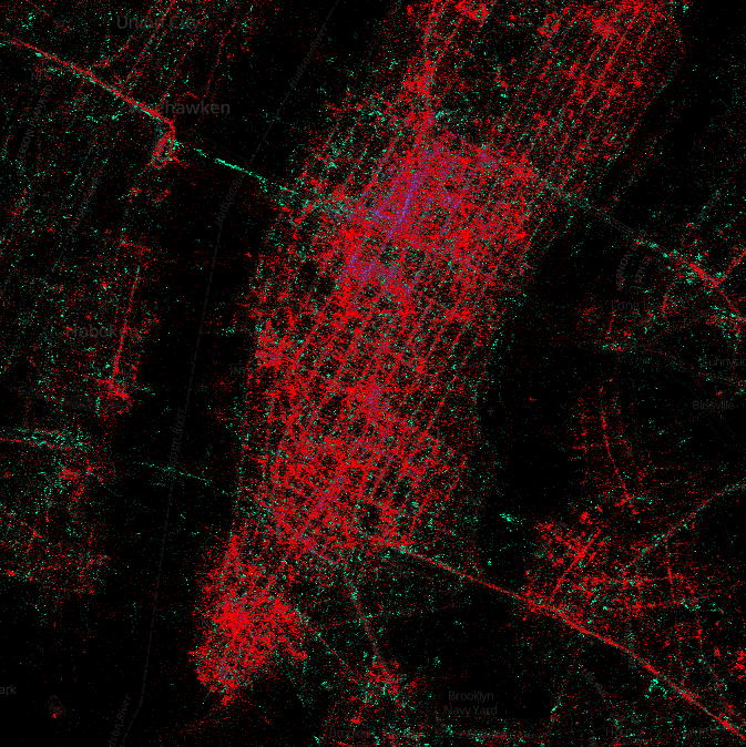
I couldn’t find another major city in the US with higher Blackberry usage than good ol’ NYC. Concentrated especially in midtown and on Wall Street, Blackberry clearly still has something of a hold on businesses in New York, though obviously the iPhone is the smartphone of choice for a majority of New Yorkers.
Baltimore, MD
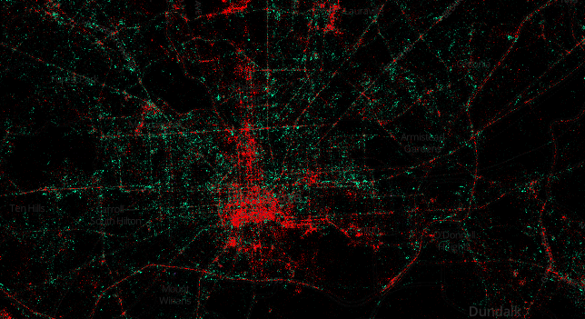
The story here seems to be one of division along socio-economic lines. In downtown and midtown Baltimore, the realm of businesses, JHU and UMBC students, and significantly higher rents, iPhone usage is very high. In the more economically challenged East and West Baltimore, Android devices seem to be the norm. A clear spike in iPhone usage in the Northern suburbs of Baltimore also appears on this map.
San Francisco, CA
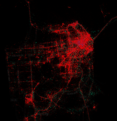
I don’t think anyone in San Fran has even heard of Android yet.
Interested in exploring the map for yourself? You can check it out here: http://www.mapbox.com/labs/twitter-gnip/brands/. Just keep in mind that because 100% of the data comes from Twitter, the data doesn’t reflect all smartphone usage, just tweets.